Prerequisites
In this article we're looking at:
The UI Builder node lets you create user interfaces using a simple drag & drop interface. Unlike the Render UI node which requires writing HTML templates, the UI Builder provides pre-built components that you can configure visually and arrange by dragging them into the desired order.
Most nodes use dynamic data somewhere (more on using placeholders for dynamic data in the using placeholders section below) and so it's important to test your node with input data.
The Input data is displayed as individual editable fields in the Preview box. When you have a previous node in your flow, the output data from that node automatically appears as the test input data for the current node. You can edit each field value individually to test different scenarios.
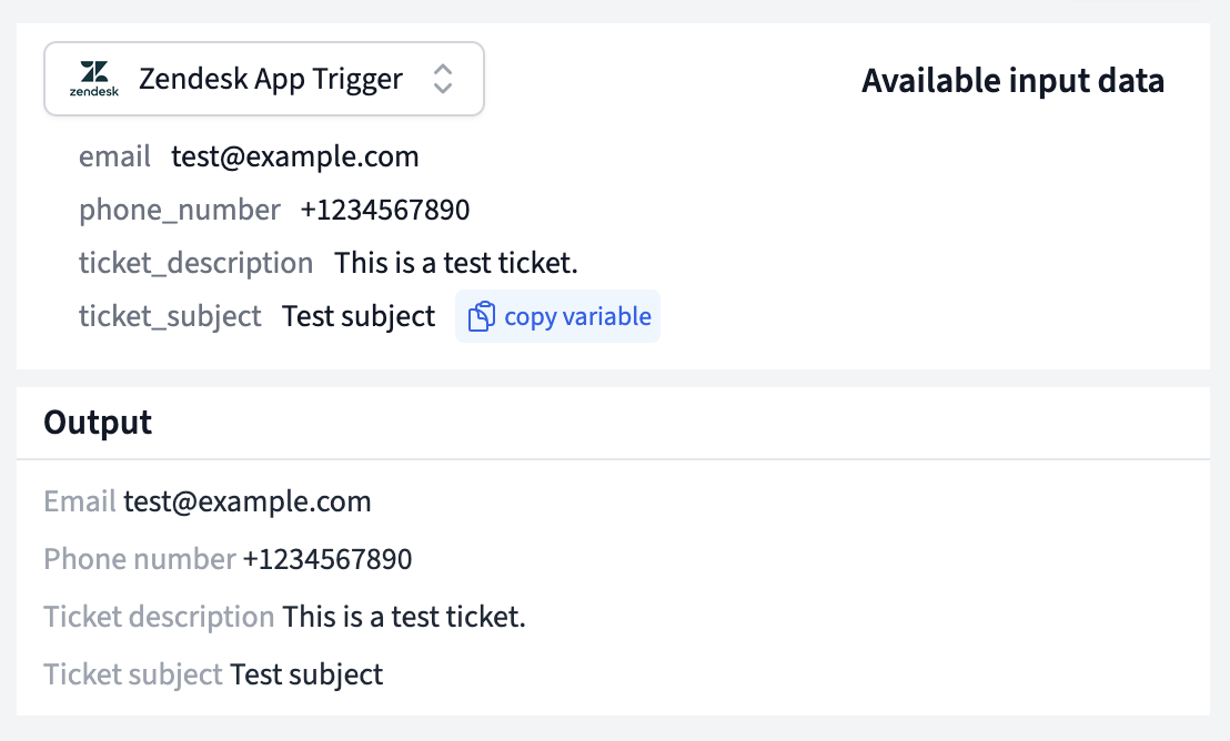
If this is the first node in your flow (connected directly to a trigger), the test input data will be populated with the data captured from your trigger.
When you first create a UI Builder node and it doesn't have any components yet, you'll see a "Generate UI" button in the preview area.
Clicking this button will automatically generate a simple user interface based on your test input data. This works best when your input data is either a simple object that only contains properties or an array of such objects. If your input data is nested or complicated, you might need to manually create components.
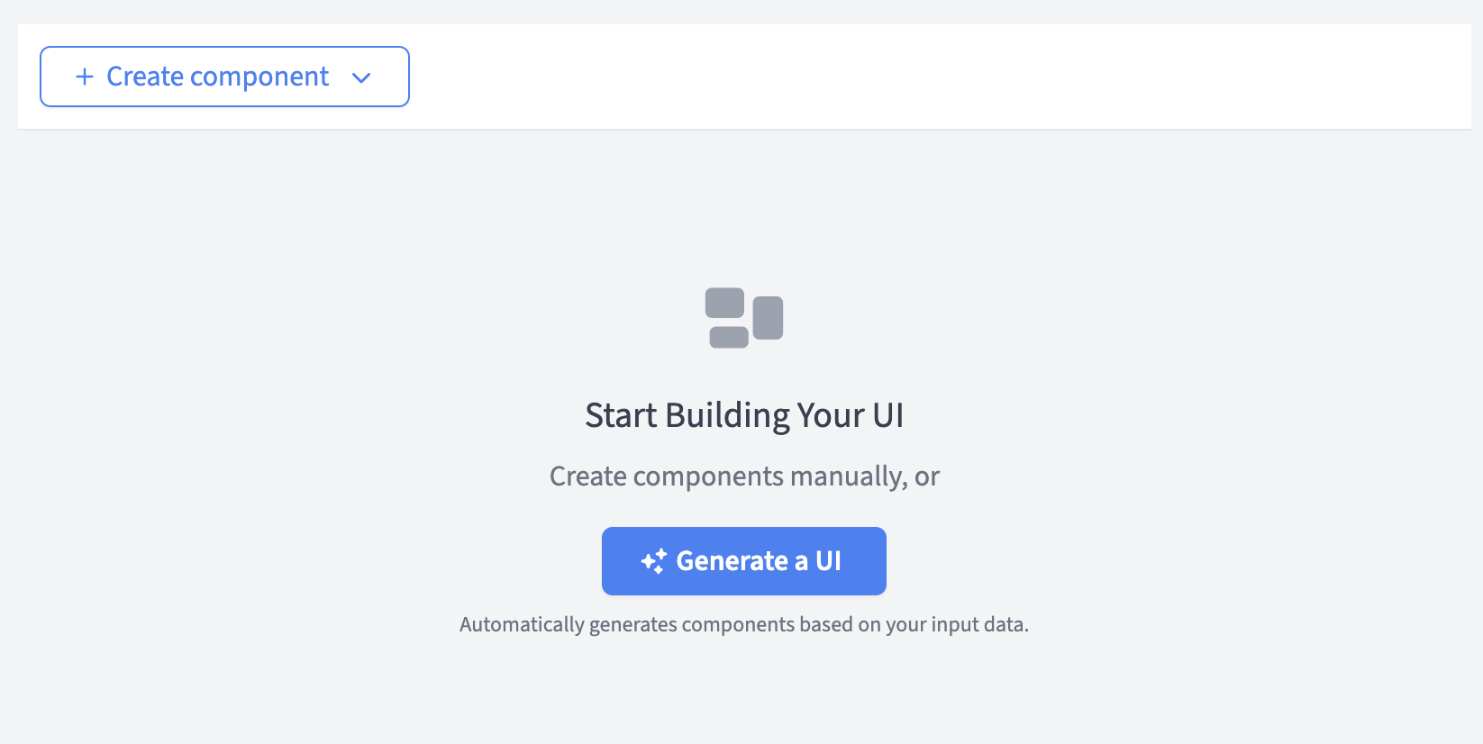
The generated UI will create Label & Value components for each property in your data, giving you a starting point that you can then customize and expand upon.
The UI Builder provides several pre-built components that you can add to your interface:
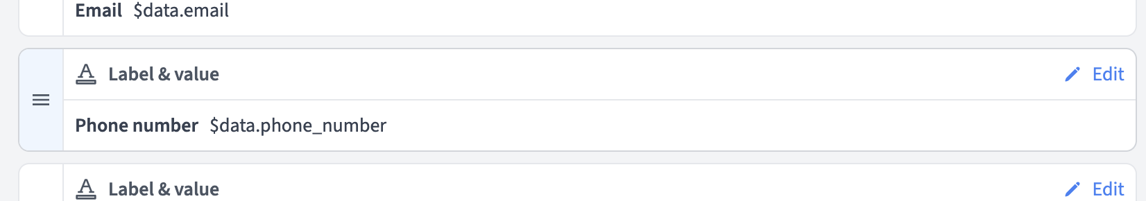
Displays a label alongside a dynamic value. Perfect for showing key-value pairs like "Customer Name: John Doe" or "Order Total: $129.99".
Creates a clickable button that opens a URL in a new window. Useful for actions like "View Order" or "Contact Customer".
Creates a text link that opens a URL. Similar to buttons but with a simpler text-based appearance.
To add a component to your interface:
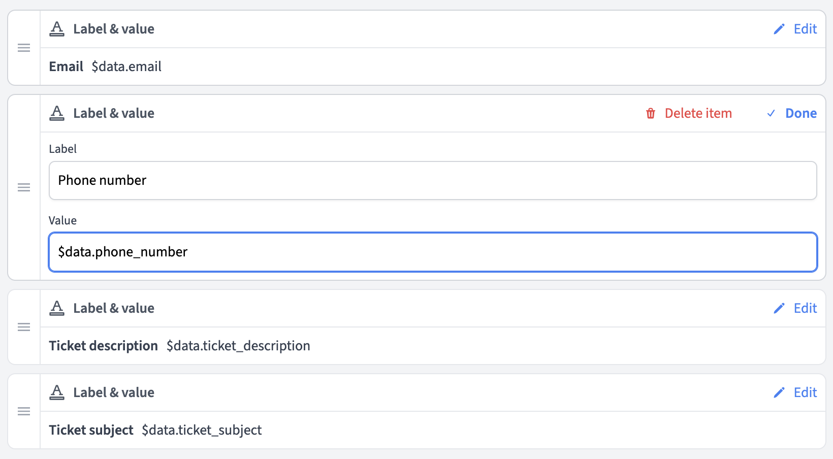
Each component has specific properties you can configure:
Label & Value components:
Button and Link components:
You can drag components to reorder them in your interface. Simply grab the drag handle (≡) on the left side of any component and drag it to the desired position.
To dynamically insert data in your components, you can use placeholders. The UI Builder uses FactBranch's standard placeholder syntax:
FactBranch placeholders:
$data.property_name - Insert a value from your input data
$nodes.node_name.property - Insert a value from another node's output
$trigger.property - Insert a value from your trigger data
To conveniently get the correct placeholder syntax, you can copy it directly from the test input data fields. Just click the "copy variable" button next to the field you want to use, and it will be copied to your clipboard. You can then paste it into the component's configuration.
Let's say your node receives the following data from the previous node or trigger:
{
  "customer_id": 12345,
  "customer_name": "Alice Appleseed",
  "order_total": "$129.99",
  "order_status": "shipped",
  "tracking_url": "https://tracking.example.com/12345"
}
You could create an interface like this:
Label & Value component:
Customer$data.customer_nameLabel & Value component:
Order Total$data.order_totalLabel & Value component:
Status$data.order_statusButton component:
Track Package$data.tracking_urlComponent not showing data:
- Check that your placeholder syntax is correct
- Verify that the data field exists in your test input data
- Make sure you're using the right variable (data, nodes, or trigger)
Drag & drop not working: - Make sure you're grabbing the drag handle (≡) on the left side of components - Try refreshing the page if drag & drop becomes unresponsive
Links or buttons not working: - Ensure URLs are properly formatted - Check that dynamic URL placeholders resolve to valid URLs - Test with static URLs first to verify functionality